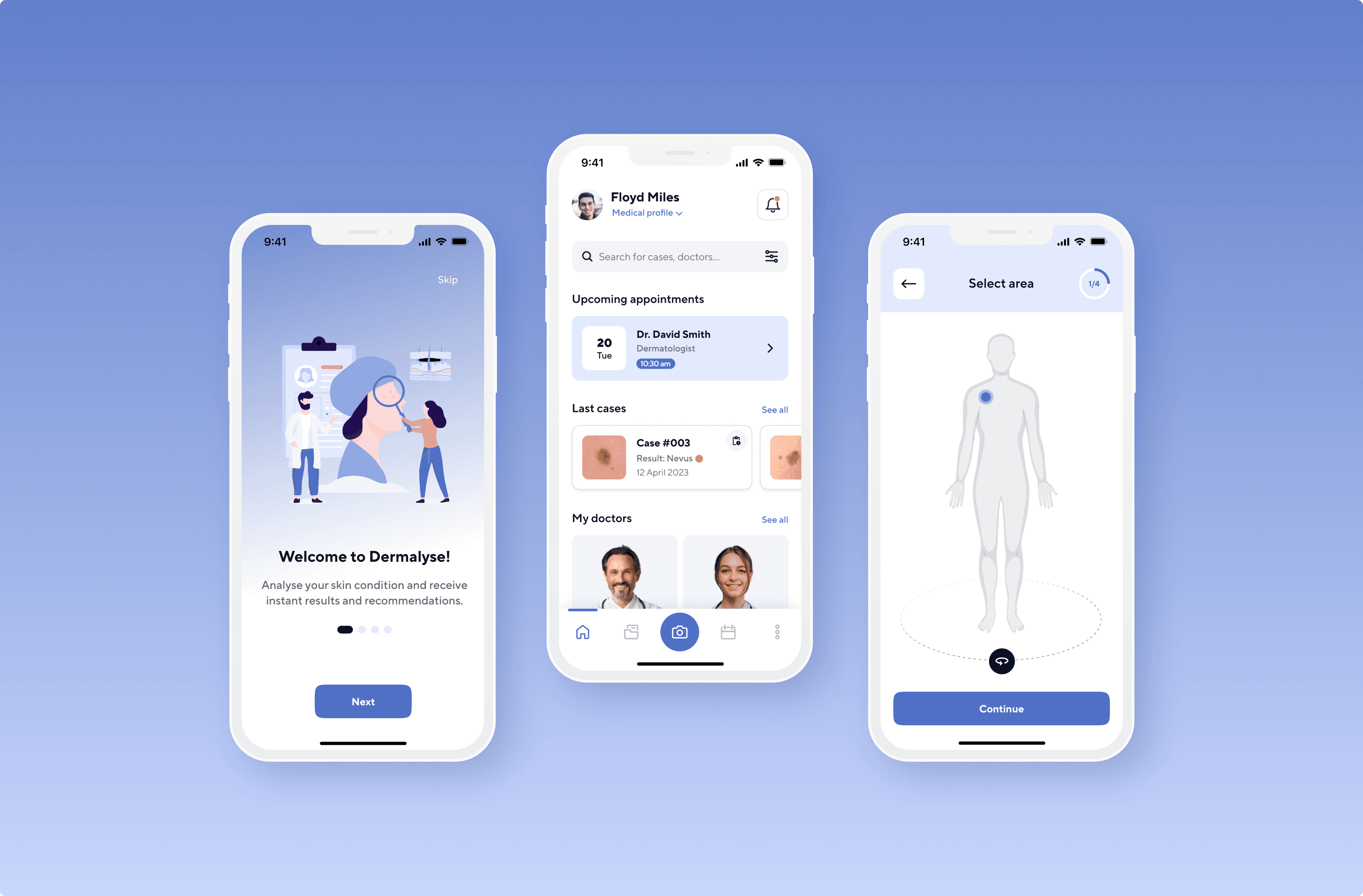
Revamp of Dermalyse app
Timeline
1 week (Jun, 2023)
Role
Tools
Figma
Introduction
About a year ago, at the start of my journey into the world of UX design, I embarked on a project that holds a special place in my portfolio – Dermalyse**. This project stands as a testament to the considerable time and effort I dedicated to crafting a unique and innovative dermatology app.
As my journey progressed, I seized the opportunity to enrich my skill set through a UI design course. This experience provided me with a deeper exploration of design intricacies, including colour psychology, typography principles, spacing and much more!. It was at this point that I realised all the mistakes I had made when designing Dermalyse. The project's core was solid, but the visual language and interface needed a touch-up to sync better with users and the medical theme.
For a glimpse into the original version, I invite you to explore the following link: Dermalyse
**Dermalyse employs an AI system to analyse images of skin conditions taken by users via their smartphones. With a focus on enhancing user experience and delivering medically-backed outcomes, the app establishes a seamless connection between users and their preferred doctors or dermatologists, streamlining insurance processes as well. This approach gives medical professionals access to preliminary analyses, enabling them to better prioritise urgent cases.
My role
After completing my UI design training, I allocated a week to rebrand the app and enhance the visual design. During this time, I took on the role of a UI designer and focused on redesigning the screens of the main flow to capture the intended final look and feel.
App redesign objective
Designed as a mobile healthcare solution, this app caters to a diverse range of users with varying ages, physical and psychological characteristics, health conditions, and attitudes. This broad target audience presents a unique challenge. Therefore, my aim was to revamp the layout, giving it a more professional and polished appearance, without compromising functionality and with a strong focus on accessibility (beyond the AA large level of WCAG).

Visual style
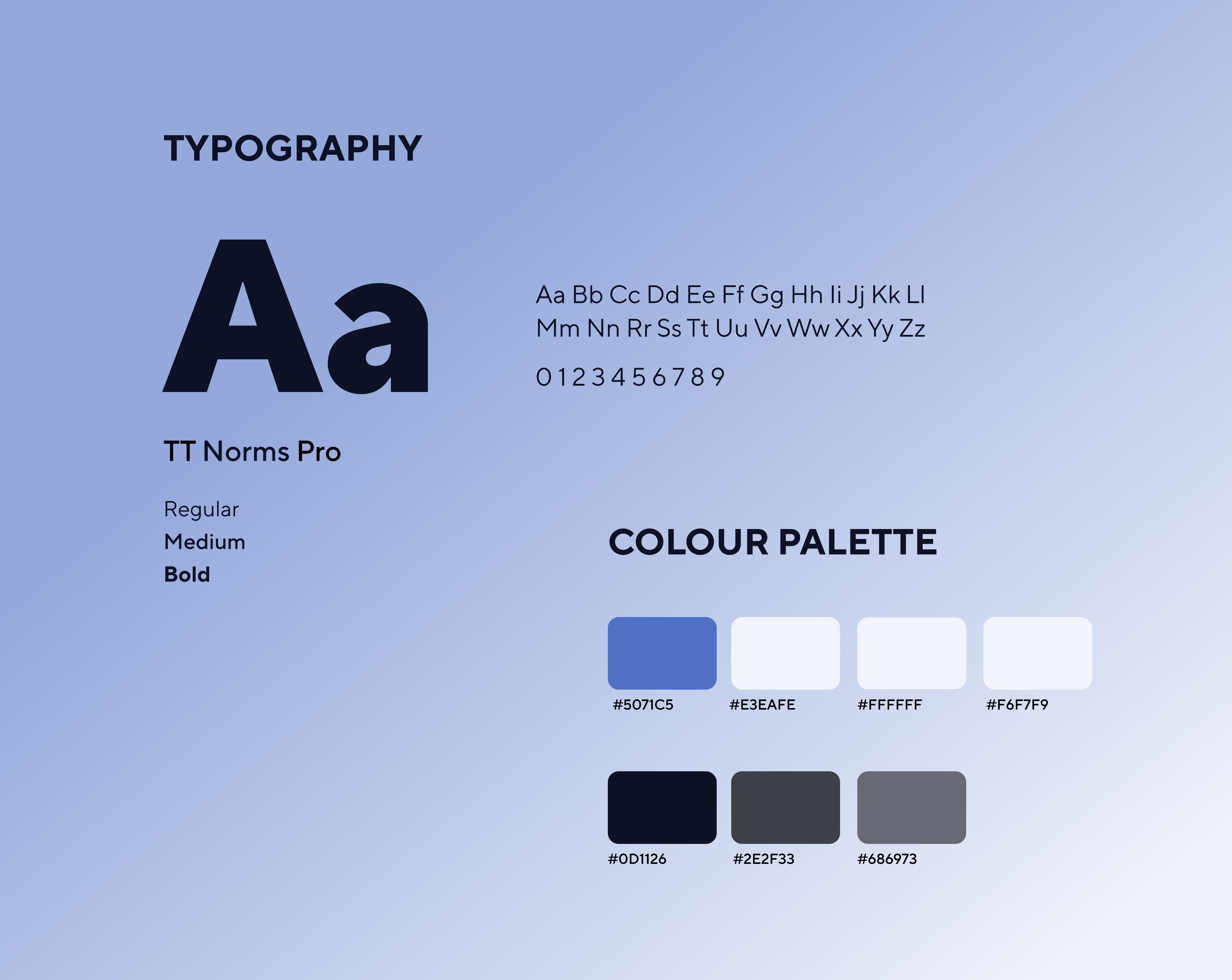
Colour palette
In the initial design, the color palette was rather vivid, potentially conveying a sense of levity, particularly to older segments of the audience.
To achieve a clean and soothing design, I opted for a white background and an indigo blue as the primary colour. This choice was deliberate, as I wanted to create a familiar experience, understanding that users might receive unfavourable analysis results in some cases. Blue not only symbolises trust and reliability but is also visible to individuals with colourblindness.
Typography
For optimum legibility and a clean aesthetic, I selected the "TT norms pro" sans-serif typeface in various weights. This typeface reflects elegance and minimalism, making it an ideal fit for the app's layout. I decided to use a font size of 16px for the body copy to ensure readability for all audiences.
Icons & Imagery
I went with a more intuitive set of icons and also tweaked and changed some of the illustrations. The goal was to establish a serene and harmonious style that would blend seamlessly with the other elements of the application.
Final design
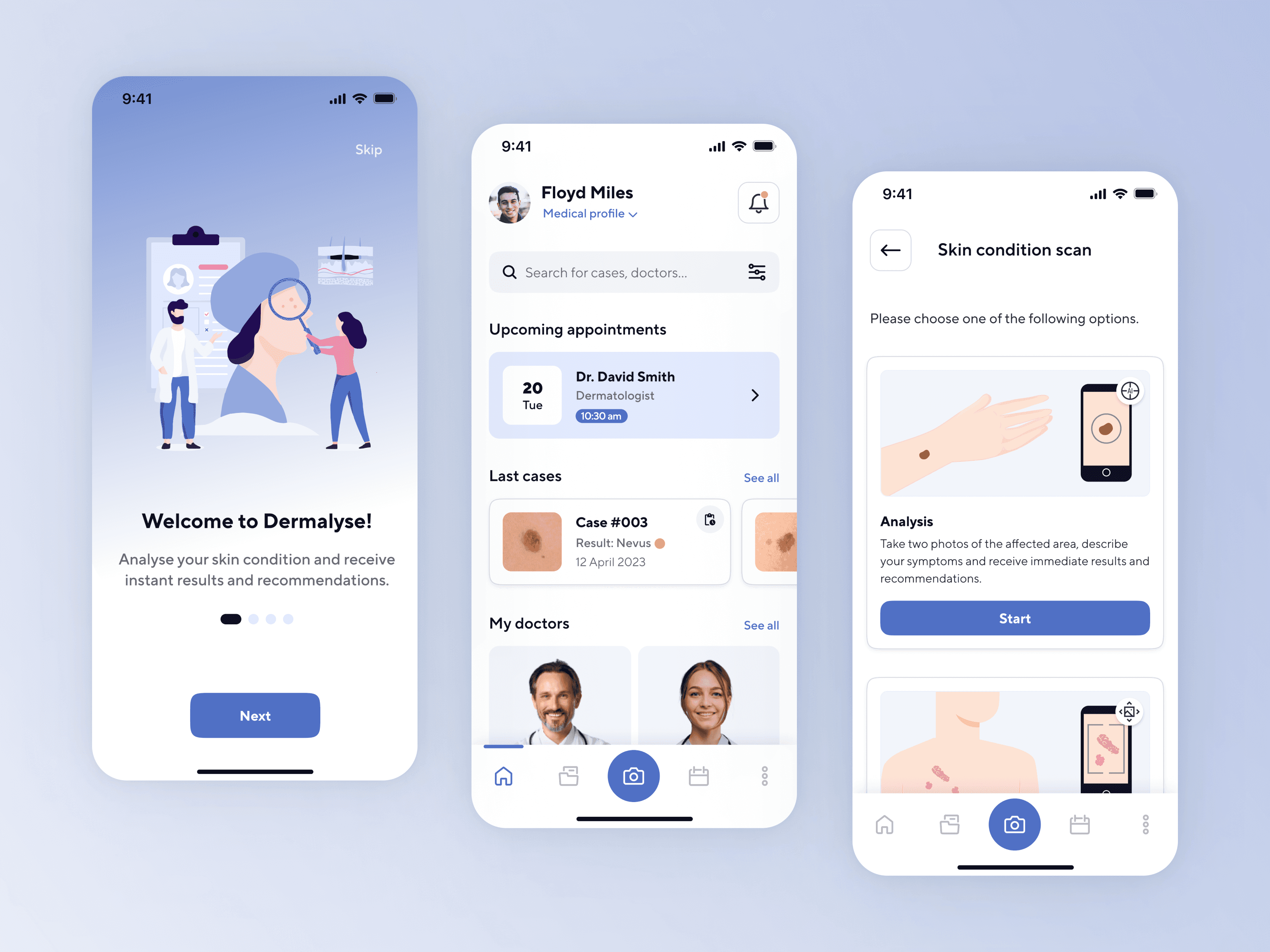
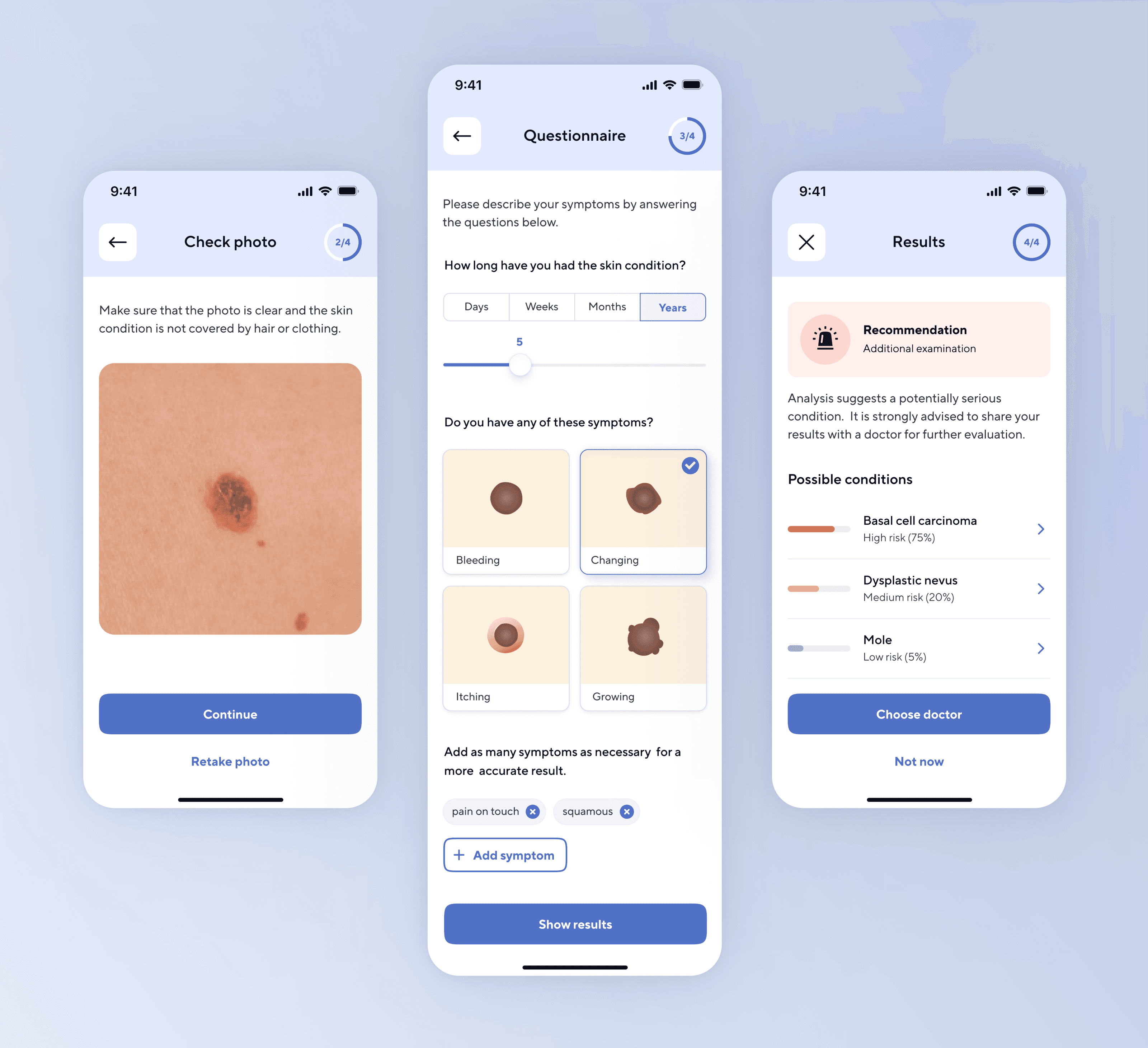
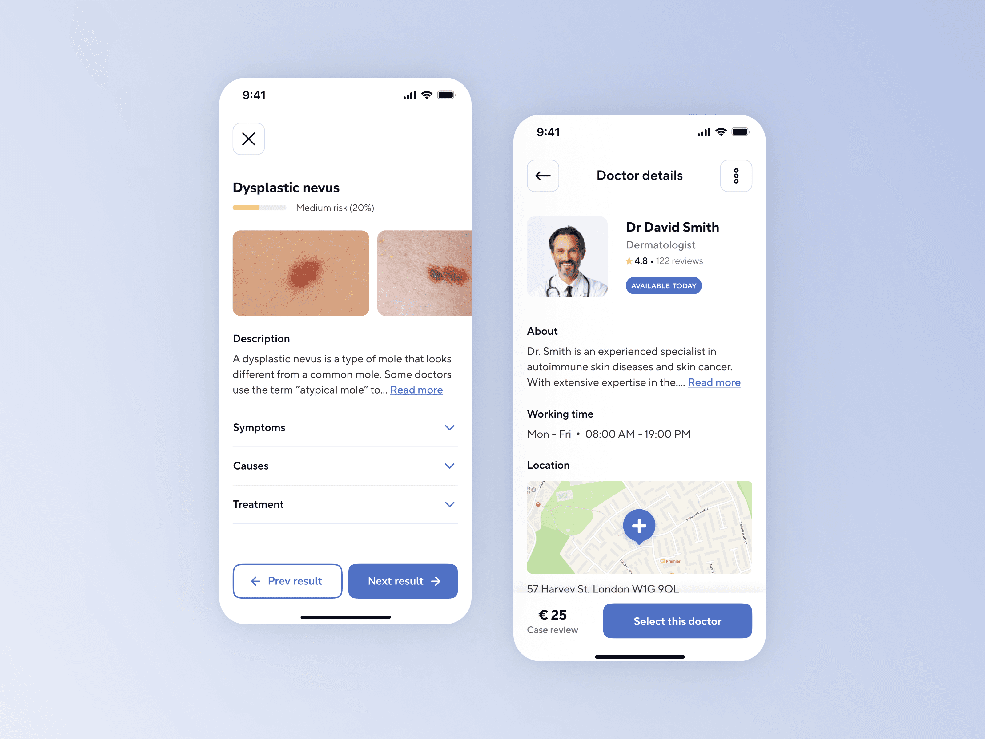
With the typography and color palette chosen, I proceeded to reimagine the primary screens of the application. Below showcases the refreshed interface design of Dermalyse.
Onboarding & Dashboard
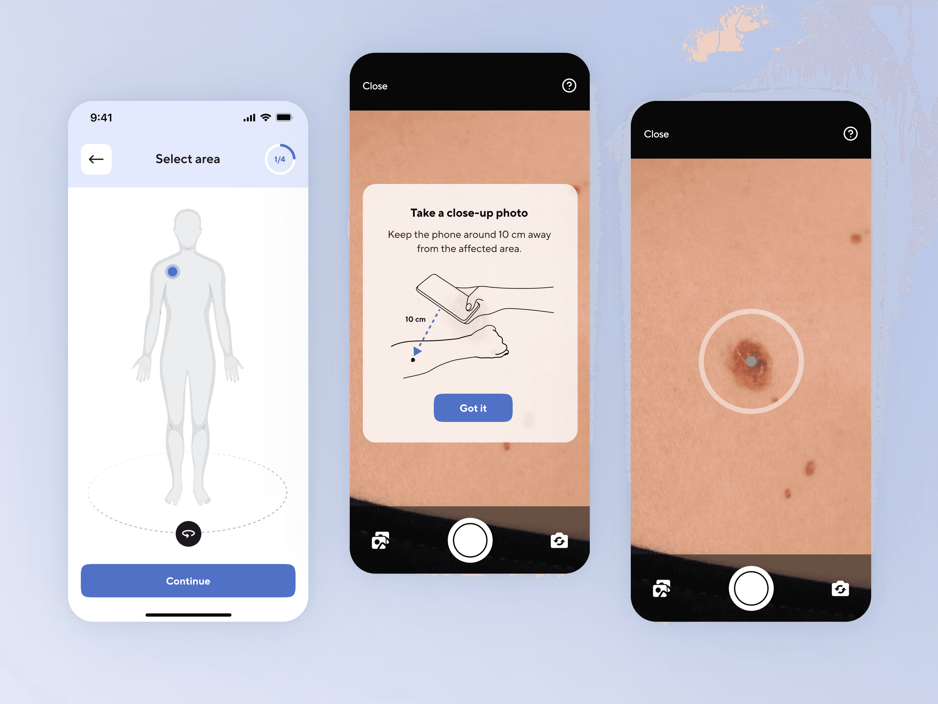
Skin condition analysis: 1st step
Symptoms questionnaire & Results
Result description & Doctor details
Next steps
As time goes on, my plan is to gradually apply the new style guide to the remaining screens and user flows of the application. I also intend to conduct usability tests to ensure a smooth user experience and address any potential usability issues that might come up.
Final thoughts
Revisiting previous projects takes on special significance as one's skill set grows. For me, there was a clear gap in my grasp of visual interface design during the initial stages. However, after investing time in honing my skills and truly understanding design principles, I felt the confidence to return to the project. The evolution of a designer's skills takes time and happens gradually. Taking on the role of UX designer involves a lifelong learning journey, and it is precisely this aspect that makes it so inspiring and fulfilling.