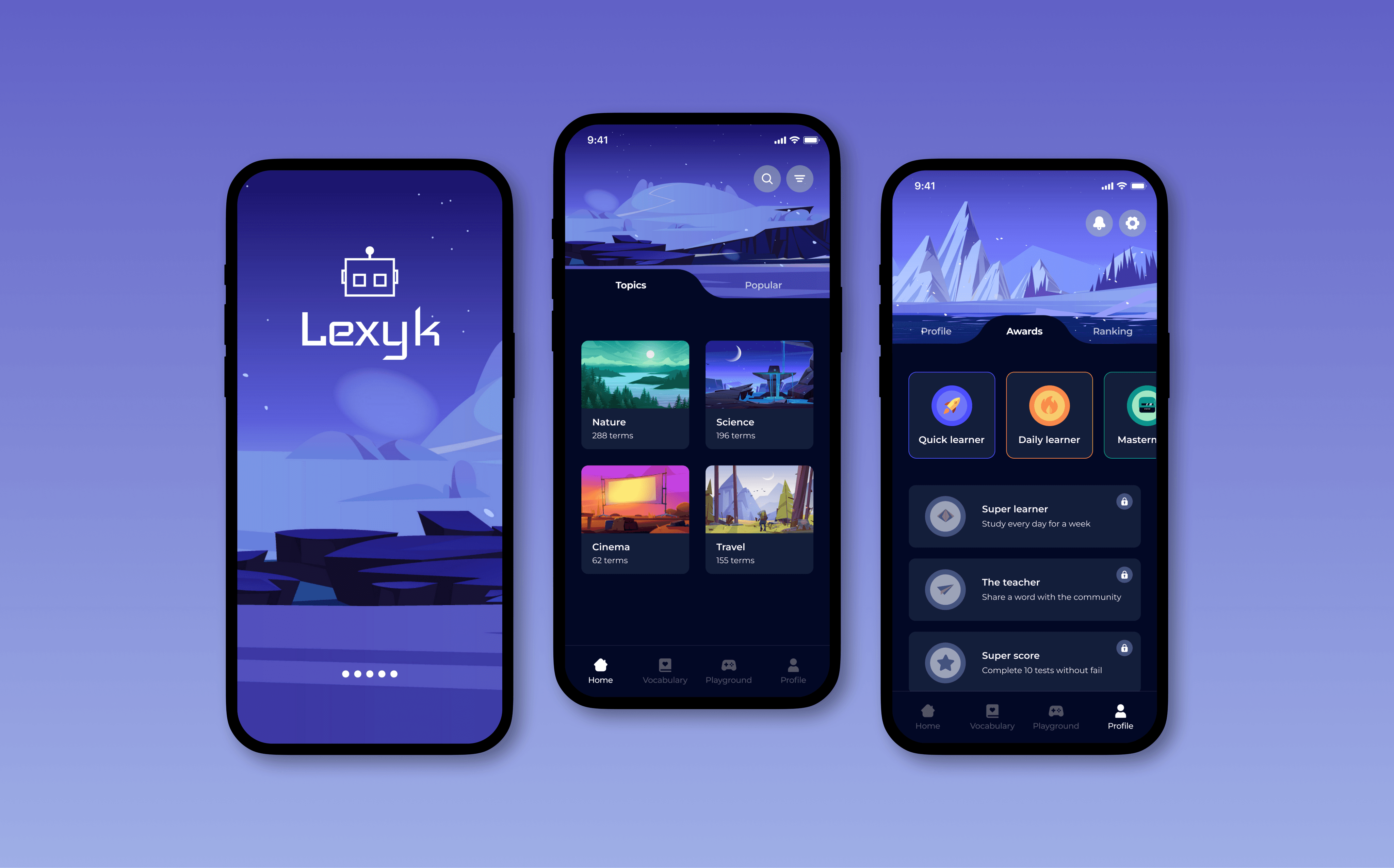
Lexyk
Timeline
3 weeks (Mai, 2022)
2 weeks (Nov, 2022)
Role
Tools
Pen & paper, Miro, Figma
Introduction
Lexyk is an English vocabulary learning app that empowers users to curate their personalised vocabulary lists, focusing on the words they truly need. The app offers diverse learning methods and interactive games to make the learning process enjoyable and engaging. Additionally, Lexyk fosters a sense of community by encouraging users to share their vocabulary lists and participate in friendly competitions with other learners.
In this case study, I will be sharing my first experience in designing a mobile application from scratch, aimed at assisting students in their language learning journey.
My role
Lexyk was the first project I did during my training as a UX designer and where I was able to put into practice all the concepts and methods I had learned so far. The goal was to create a vocabulary learning app within 3 weeks. Despite the tight deadline, I prioritised extensive user research to obtain data-driven solutions and translate them into an interactive paper prototype. A few months later, I focused on interface design and developed a high-fidelity prototype, introducing additional features that were tested by users to optimise usability and intuitiveness.
DISCOVER & DEFINE
Competitive analysis
User interviews
User persona
Use stories
IDEATE
Defining solution
User flows
Paper prototype
TESTING & PROTOTYPING
Usability testing
Style guide
High-fid prototype
Problem
Learning a new language requires a lot of time and dedication, but many language apps fail to meet learners' specific needs. They often focus on grammar and vocabulary without addressing the learner's actual proficiency level. As a result, learners become disengaged due to repetitive and irrelevant content, leading to dropouts.
Goal
The aim was to design an app that helps people create a study routine through playful features, offering relevant and adapted vocabulary, where users could decide which words they want to learn and discard the ones they already know.
I started to think about potential solutions and here are the ideas I came up with:
Placement test to assess student's language proficiency level.
Lessons structured around different topics and themes.
Possibility to create personalised vocabulary lists.
Different learning methods and playful activities.
Competitive analysis
I was already familiar with Babbel and Duolingo, and wanted to broaden my perspective and examine other apps with a specific focus on vocabulary learning and other educational concepts. The aim was to find out what kind of features they offered to their users and how they approached the learning process, in order to identify possible opportunities for improvement and innovation in the design of my project.

QUIZLET

WORDUP

MEMRISE
User research
Before starting the design process, I gathered valuable insights from potential users through remote and in-person interviews with three participants. By listening to their experiences and expectations regarding vocabulary learning apps, I aimed to set aside my own assumptions and gain a deep understanding of their needs and pain points.
This research helped me identify what had worked well for them in the past, what could be improved, and ultimately, how I could create a more effective study routine for them.
FINDING #1
More relevant and adapted content
Many users expressed frustration with existing language learning apps, due to the lack of personalised content tailored to their actual level of proficiency. They often found themselves reviewing familiar material, leading to disinterest and, ultimately, dropping out of the app.
INTERVIEW QUOTE
FINDING #2
Create an effective study routine
Users need a structured and motivating approach to language learning that could seamlessly fit into their daily lives. The findings highlighted the importance of incorporating features that encourage and support users in establishing a study routine that suits their schedules and learning preferences.
INTERVIEW QUOTE
FINDING #3
Fun and interactive activities
They expressed a desire for engaging learning methods that go beyond traditional rote memorisation. Participants said that gamified elements, like interactive quizzes, could made the learning process more enjoyable and helped them maintain their motivation.
INTERVIEW QUOTE
User Persona
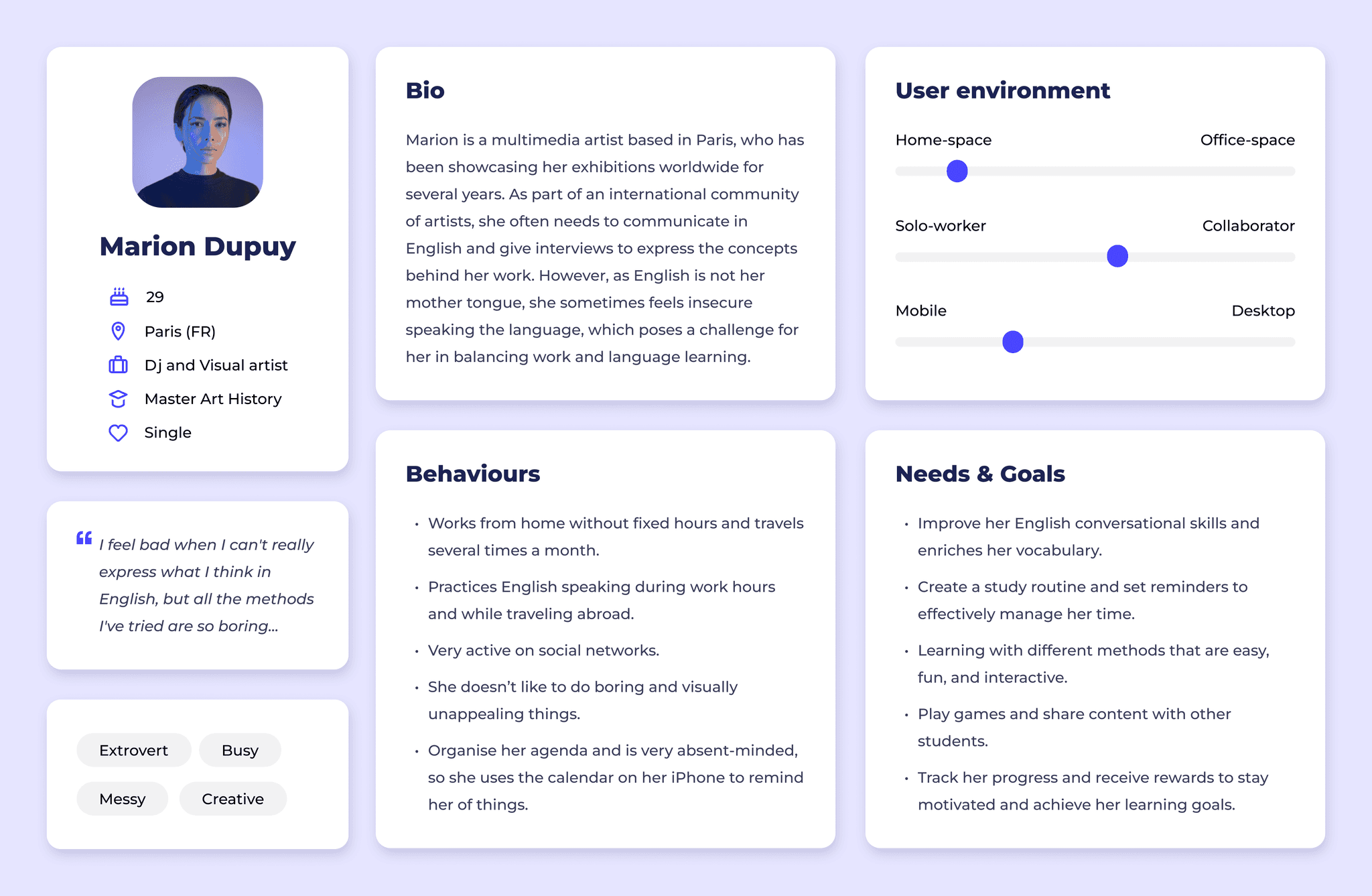
Based on the data and insights gathered during the interviews, I started to create a user persona, Marion, which represents the needs and goals of my target audience. Although this is an English vocabulary learning app, it can easily be extended to other languages.
User stories
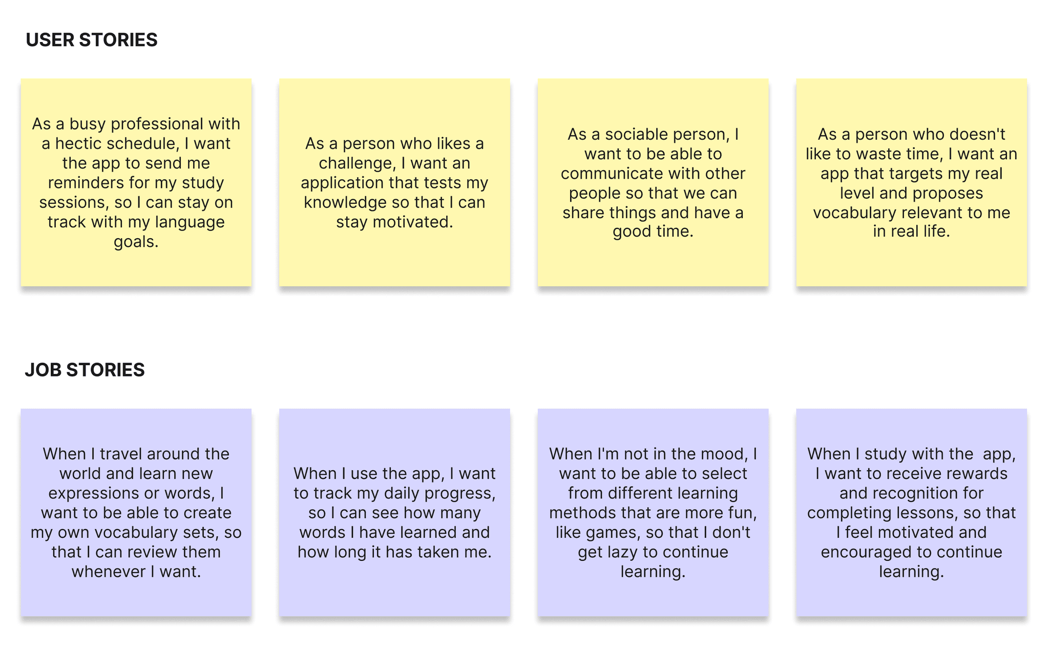
User stories allowed me to identify the most useful features for potential users of the app. Moreover, breaking down these features into smaller, more manageable parts provided a comprehensive outlook of the project's scope.
Problem statement - What does our user persona need?
Marion needs a way to incorporate a study routine into her daily life, that keeps her motivated because she needs to improve her conversational English and expand her vocabulary to better explain her work and connect with her audience. We will know this to be true when we see that Marion can fluently articulate her ideas without feeling blocked or limited by her language proficiency.
Hypothesis statement - What can we do to solve this?
We believe that by creating a vocabulary app that includes different learning methods with relevant and interactive content and rewards effort, we will achieve Marion's goals of fully improving her conversational English skills.
Key features
Based on the user research data, I started to conceptualise the specific functionalities of the application. A key focus was to empower users with the flexibility to select their desired vocabulary, avoiding structured lessons and irrelevant content. Additionally, interviews highlighted the importance of making the app interactive and playful, ensuring an engaging and enjoyable learning experience.
FEATURE #1
Placement test
An initial level test ensures that the app's content is tailored to each user's proficiency level, providing a personalised and effective learning experience.
FEATURE #2
Reminders
This feature helps users in establishing a consistent and regular study routine tailored to their preferences and schedule, by selecting specific days and times for practice.
FEATURE #3
Vocabulary lists
Users have access to an extensive collection of vocabulary lists covering various topics and grammar concepts.
FEATURE #4
My vocabulary
With this functionality, users can create custom collections of words they want to learn from the app's default lists. As they progress in their language proficiency, known words can be easily discarded from their collections. They can also add new words of their choice and share them with other students.
FEATURE #5
Learning methods
To cover different learning styles and make the learning experience more enjoyable, the app offers a range of learning methods, including flashcards, phrases & examples, writing exercises, and tests.
FEATURE #6
Playground
Users can find different interactive games designed to test their language knowledge. Whether competing with other learners or playing solo, these games provide an entertaining way to reinforce learning and track progress.
User flows
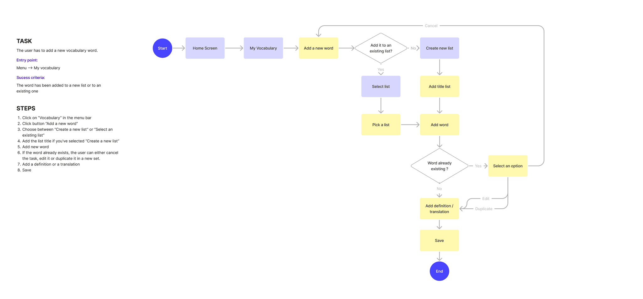
Next, I mapped out user flows to clearly illustrate the step-by-step process users would follow to accomplish their primary tasks.
Complete the onboarding and assess your english level

Add a new word to a vocabulary list
Wireframing & Prototyping
I started by sketching out the app's key features on paper, which I then turned into an interactive prototype to test with real users. Considering the project's tight timeframe, I prioritised dedicating more effort to refining the user experience rather than spending time on low-fidelity wireframes. This approach enabled me to gather essential user feedback and ensure the app's usability and functionality were well-established from the start.
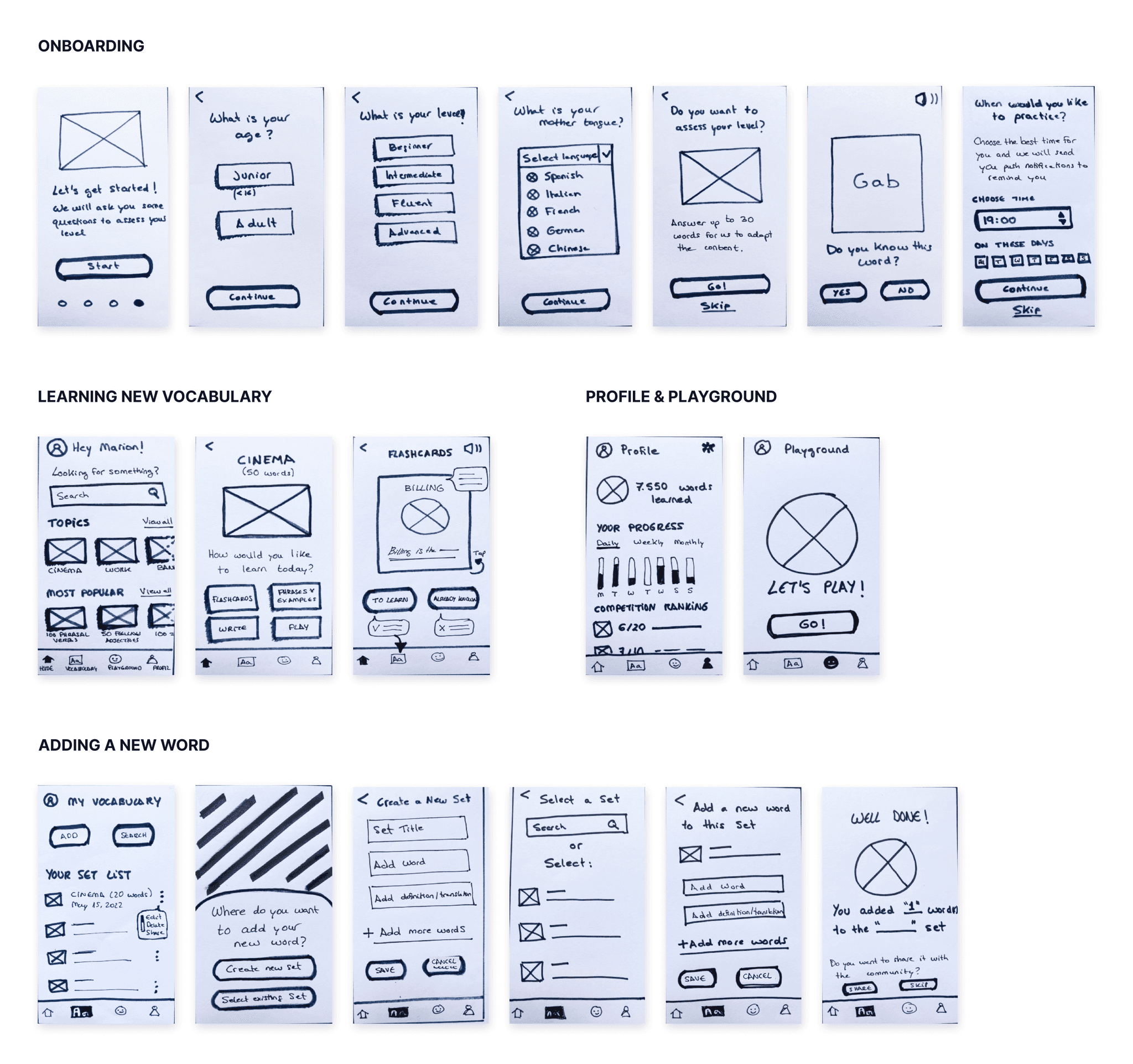
Some screens from the paper prototype
Testing with real users
I conducted remote usability testing with three participants via Meet. During the sessions, users were asked to perform a series of direct tasks on the app, with the aim of identifying potential usability issues.
Imagine you've just started a new job, and you need to improve your English quickly. A friend has told you about this new app to learn vocabulary effectively and you want to try it out.
Go through the app’s onboarding and start a "Flashcards" lesson.
Review a vocabulary list in the app.
Add a word to a new vocabulary list.
Add a new word to an existing vocabulary list.
Search for a word you want to review and edit its translation.
Find your daily progress in the app.
Test findings
I summarised the participants’ observations, and assessed their severity using the Jakob Nielsen scale. Based on the findings, I provided recommendations to address the usability issues encountered during testing.
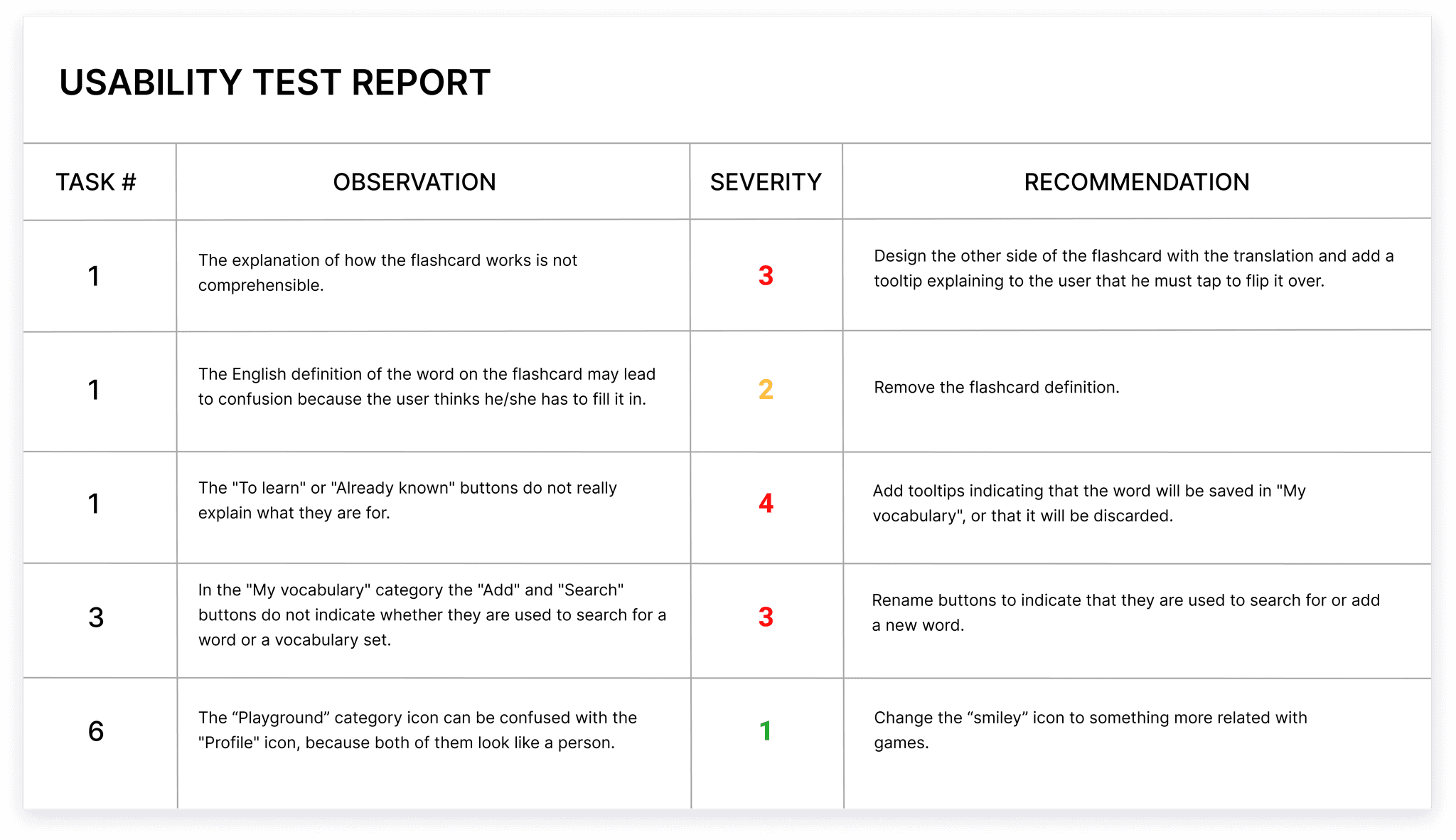
Prototype improvements
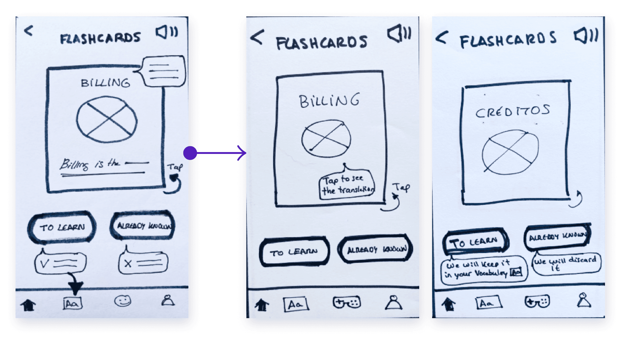
Learning vocabulary with flashcards
The explanations of how the flashcard works were not clear.
I added another screen with the flashcard flipped over and tooltips to indicate that the words to learn were stored in the vocabulary section and the others were discarded.
Adding a new word to a vocabulary list
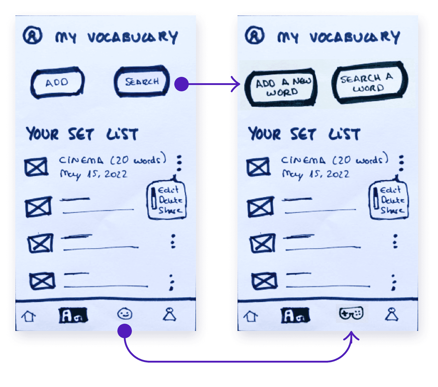
Participants didn’t know if the "Add" and "Search" buttons were for searching words or complete sets.
The buttons were modified with the text "Add a new word" and "Search for a word".
The playground icon was changed to a video game handle (confused with the profile icon).
Visual design
Style guide
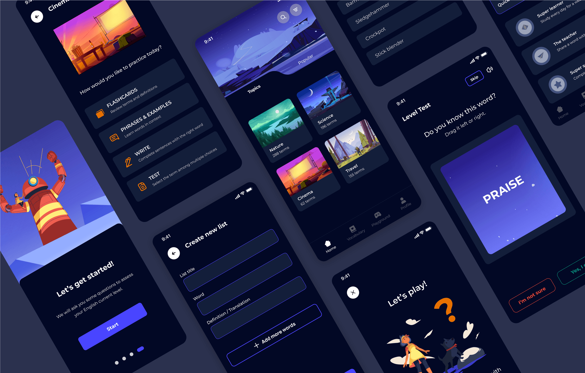
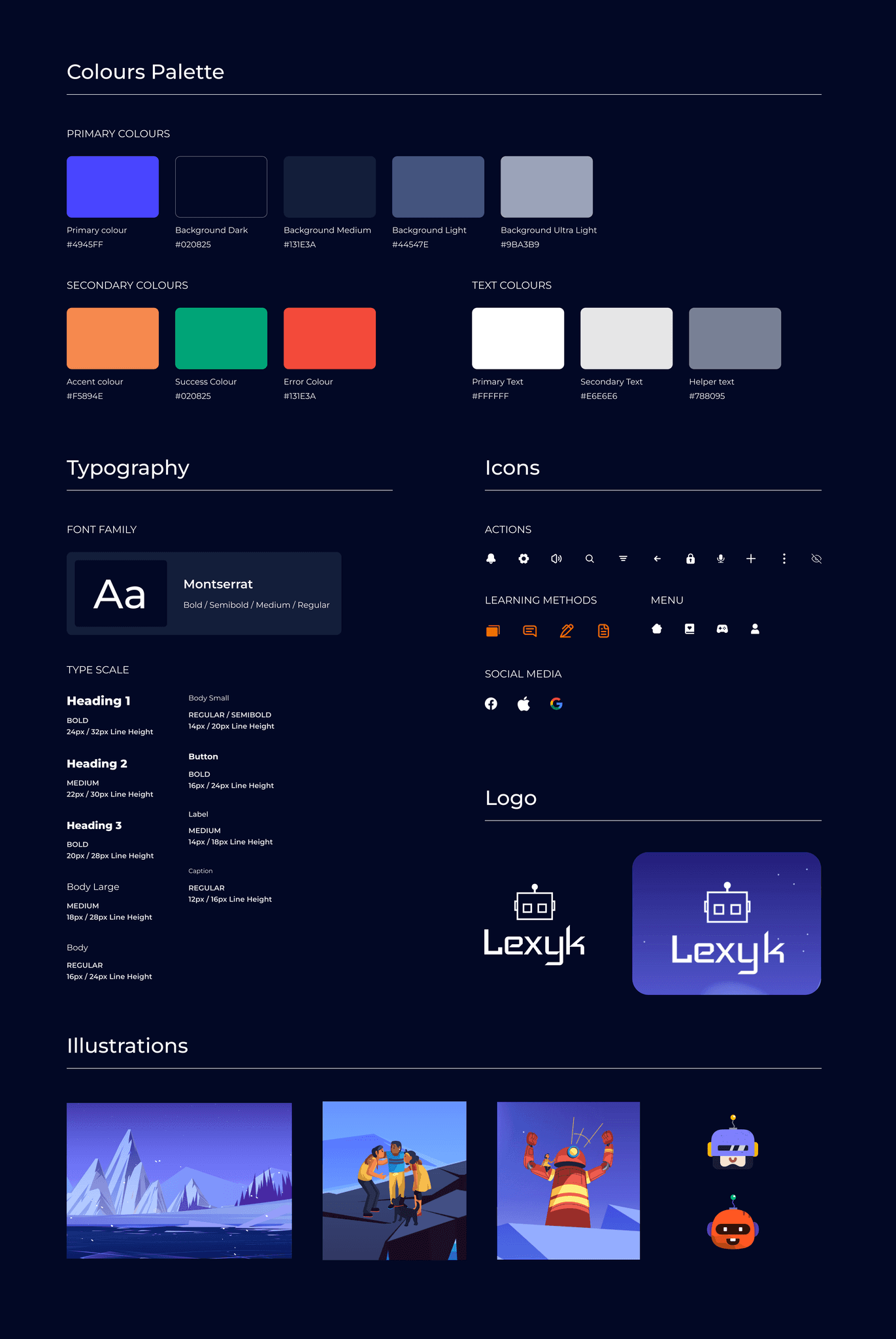
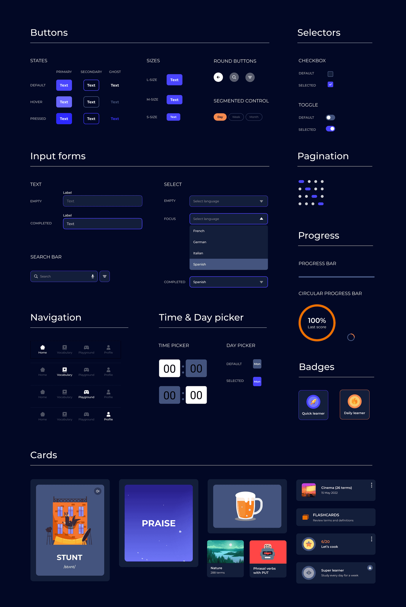
I took on an exciting challenge by opting for a dark UI theme that perfectly matched the project's context and provided an opportunity to explore the principles of this unique design style. Focusing on high contrast, I carefully curated a vibrant blue as the primary color, complemented by a lively orange as an accent for various UI elements. To add visual appeal and adhere to the adventure theme, I selected colourful illustrations throughout the app.
Final design
The design was refined after performing usability tests on the high-fidelity prototype with 2 participants from my personal network. In addition to that, I expanded the "Playground" section by introducing engaging games and incorporated a vocabulary review test to showcase a wider range of the application's functionalities. As a result of these iterations, I present below some of the screens from the final version of Lexyk.

Try it out yourself!
Final thoughts
Lexyk marked the beginning of my journey as a UX designer, where I had the opportunity to dive deep into UX methodologies through a practical case study. This experience taught me the importance of placing the user at the core of the design process. It was a valuable lesson to avoid falling into the trap of designing based on personal preferences or assumptions, especially when I had been a user of similar products.
Data-driven research became the bedrock of my decision-making, allowing me to uncover user needs and iterate until the application truly met their requirements. As a UX designer, the learning process never ceases, and that's what makes this profession so incredibly rewarding and fulfilling.
Here are a few key takeaways:
Document your design process
By taking notes and organising all the project materials, I had easy access to essential information at every stage of the design process. This practice enabled me to make well-informed decisions and maintain a clear direction for the project. It was also crucial during the second phase of the design, when I had to refer back to my files months later. This ensured that I could build upon my previous work and make continuous improvements to the design.
Simplicity saves time
Through usability tests with a paper prototype, I discovered that valuable insights could be gathered without investing significant time in creating detailed wireframes. When you have a clear vision of the project and solid data, it becomes feasible to bypass the wireframing phase and proceed directly to high-fidelity design.
